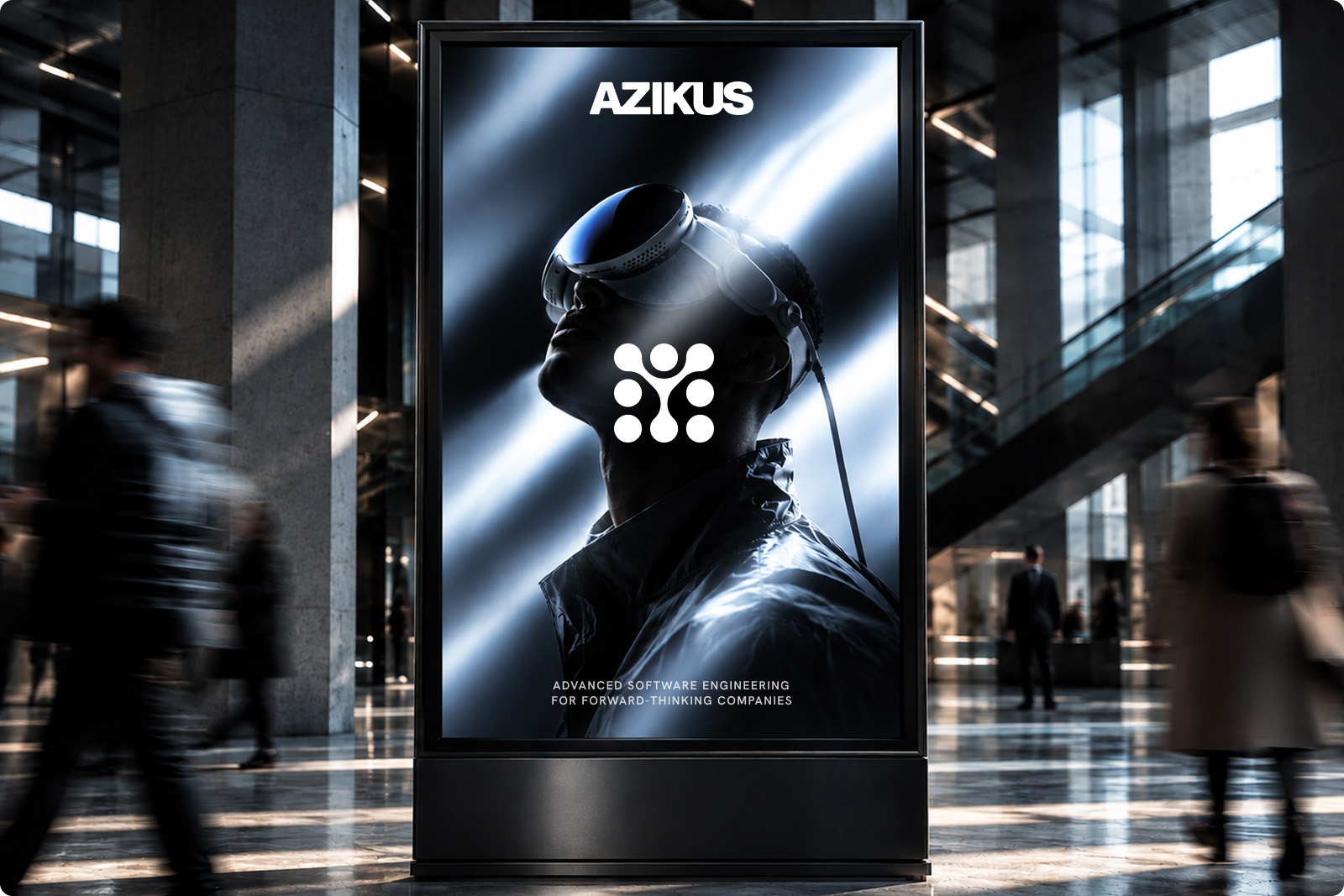
Azikus is a Zagreb-based software engineering company building advanced digital products for forward-thinking companies. As the company grew rapidly and began working with increasingly ambitious global clients, its visual identity had never had the chance to evolve with it. We saw an opportunity to build a complete brand system that could reflect the depth of its engineering expertise while giving Azikus a distinctive presence in an increasingly digital and AI-driven landscape.

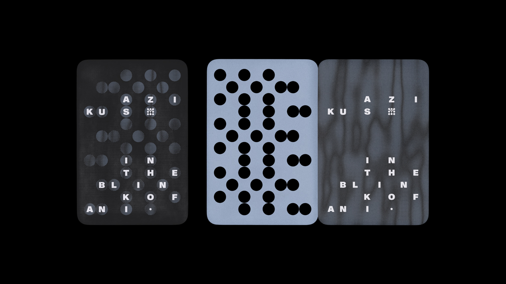
The identity is built around a simple idea: technology may be increasingly intangible, but it is still built by people. The eye became the central metaphor for that relationship — representing perception, human intelligence, and the split-second moment where thought becomes action. This idea became the foundation for the brand line, “IN THE BLINK OF AN I.” The logomark takes the concept further, encoding the letter I through a binary cipher of eight circles, with each position representing either 0 or 1. The resulting mark moves from a circular origin into a structured geometric form, connecting the human idea behind the brand with the fundamental language of computing.
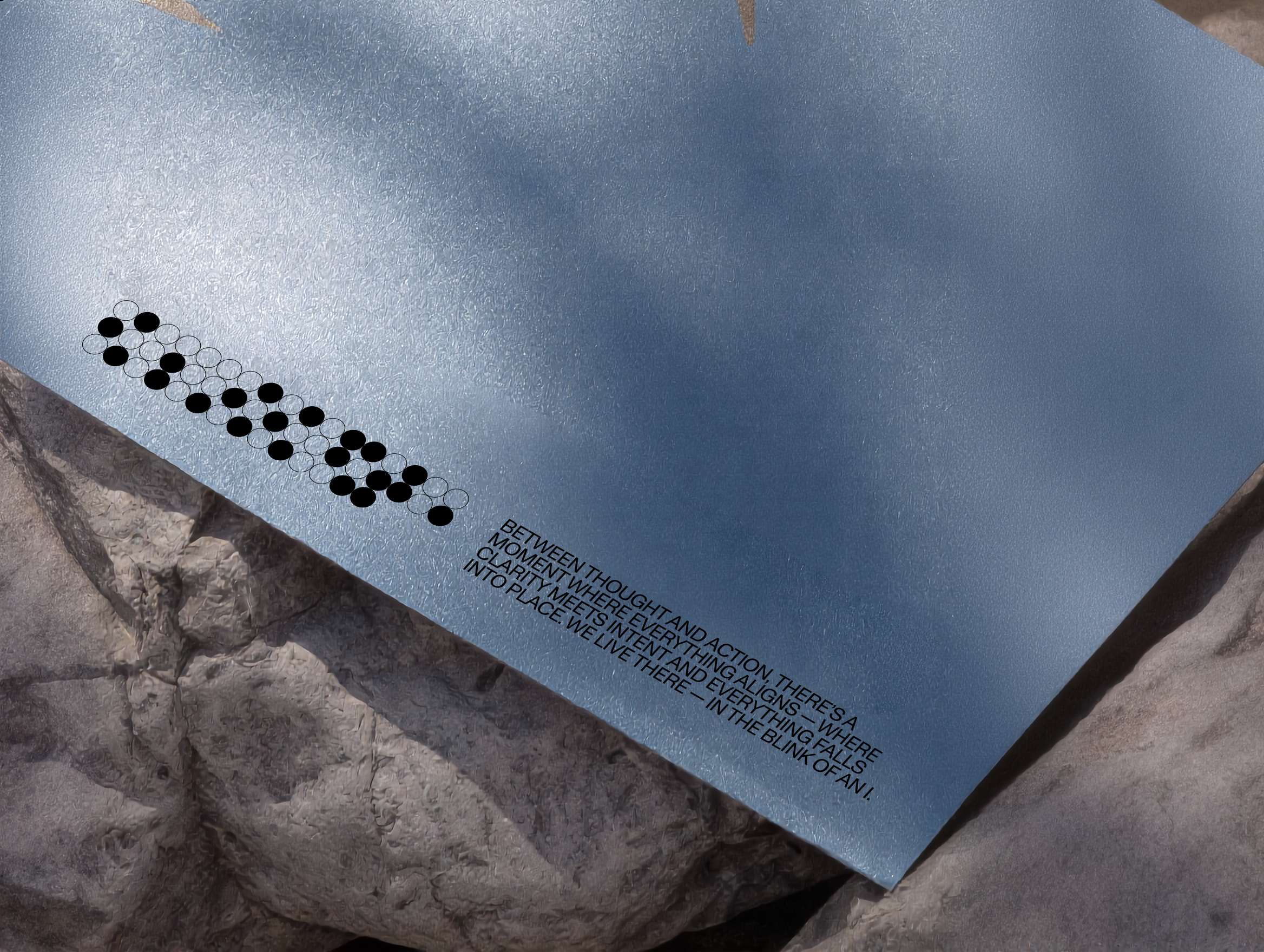
We developed a complete visual language that translates Azikus’ engineering heritage into a contemporary aesthetic. The binary logic behind the logomark becomes a generative pattern system, translating the letters of AZIKUS into binary values and mapping them onto grids of circles to create abstract compositions that carry the brand name as hidden data. A restrained palette of near-black, white, and cool iris-inspired blue-grey tones brings a sense of depth and precision, while the softened, connected treatment of the wordmark introduces a more human quality to an otherwise highly technical system.
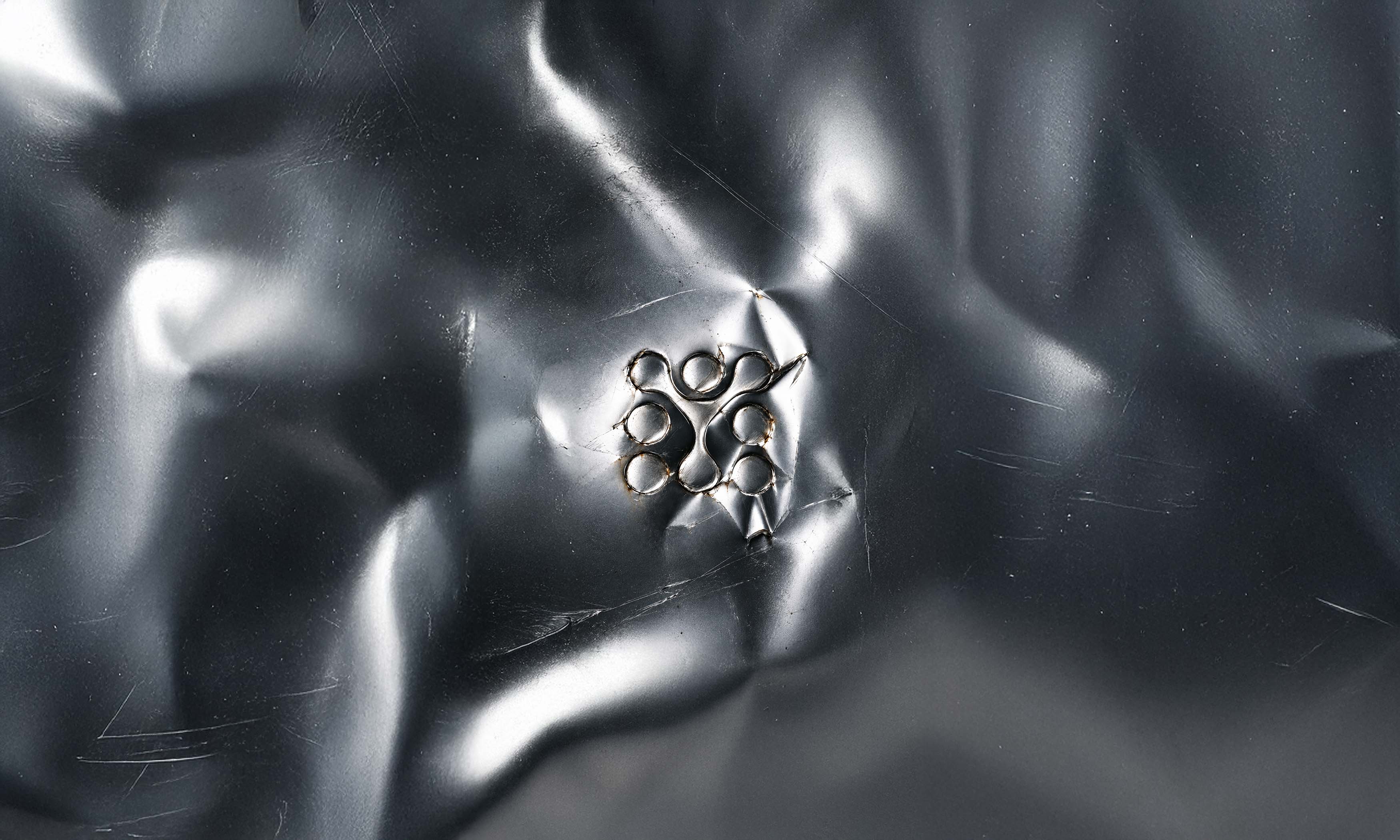
The system was designed to move, not simply sit still. Motion became an integral part of the identity, allowing the logo, binary patterns, typography, and visual assets to behave as a living system across digital touchpoints. We also developed a custom 3D tool that turns the symbol into a manipulable object, allowing the team to experiment with its form, movement, and behaviour and export bespoke animations directly from the system. This extends the identity beyond a fixed set of brand assets into a flexible visual engine — one capable of generating new expressions while remaining unmistakably Azikus.