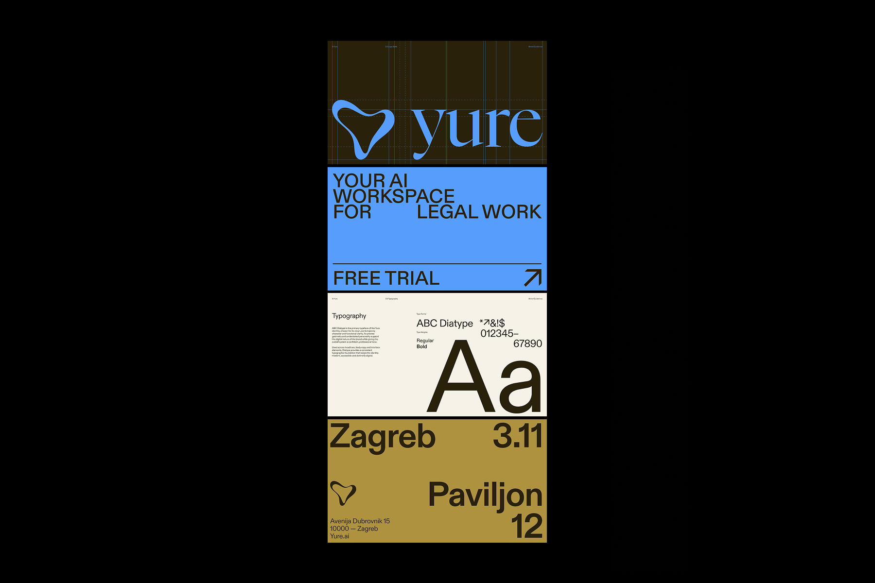
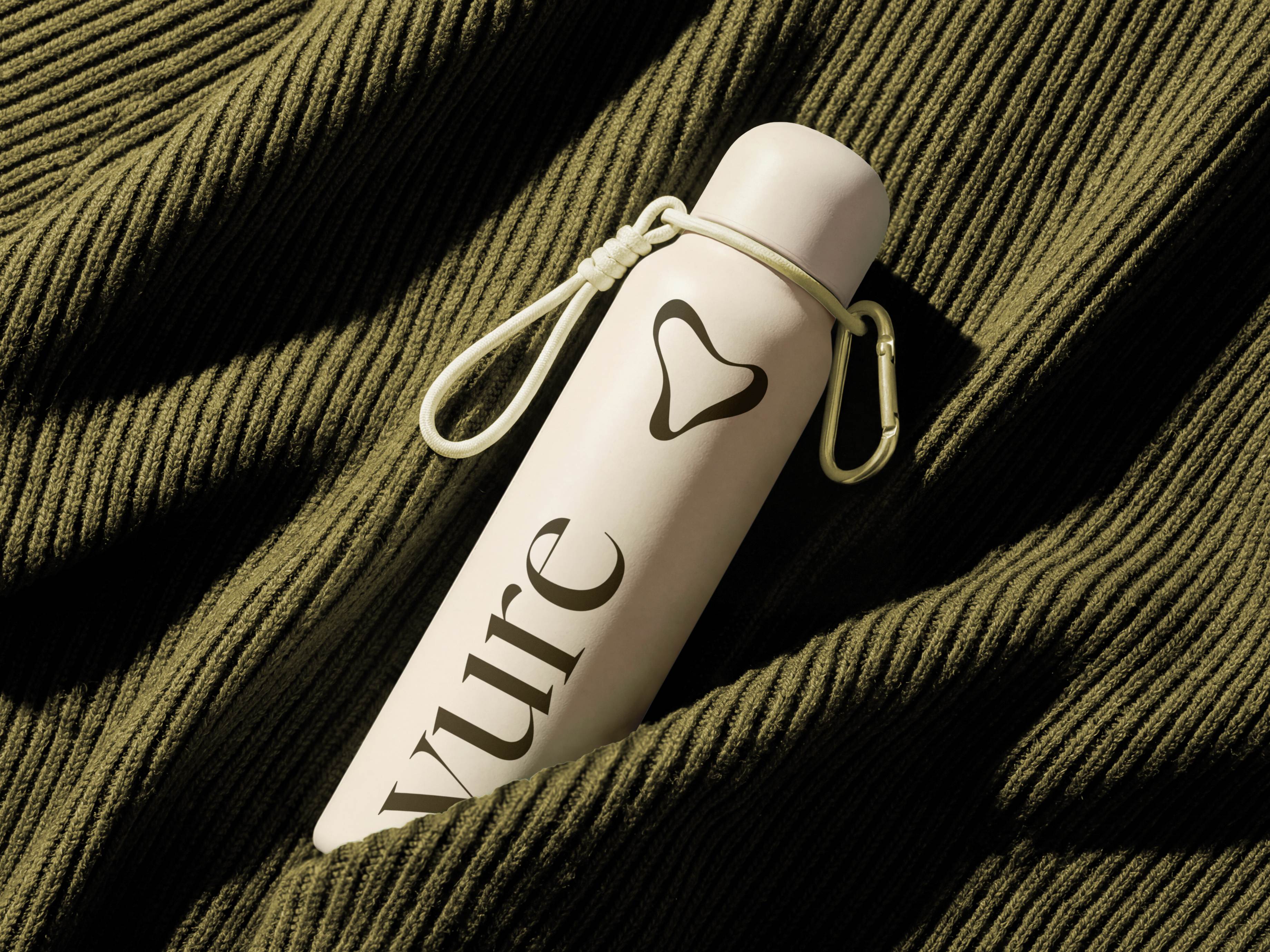
Yure is a Croatian AI startup rethinking how legal professionals research, process information and navigate complex workflows. With ambitions to expand internationally and strengthen its position with investors, Yure needed a distinctive identity that could communicate the product’s value, build trust and support its next stage of growth. The new brand and product experience were designed to work as one cohesive system.
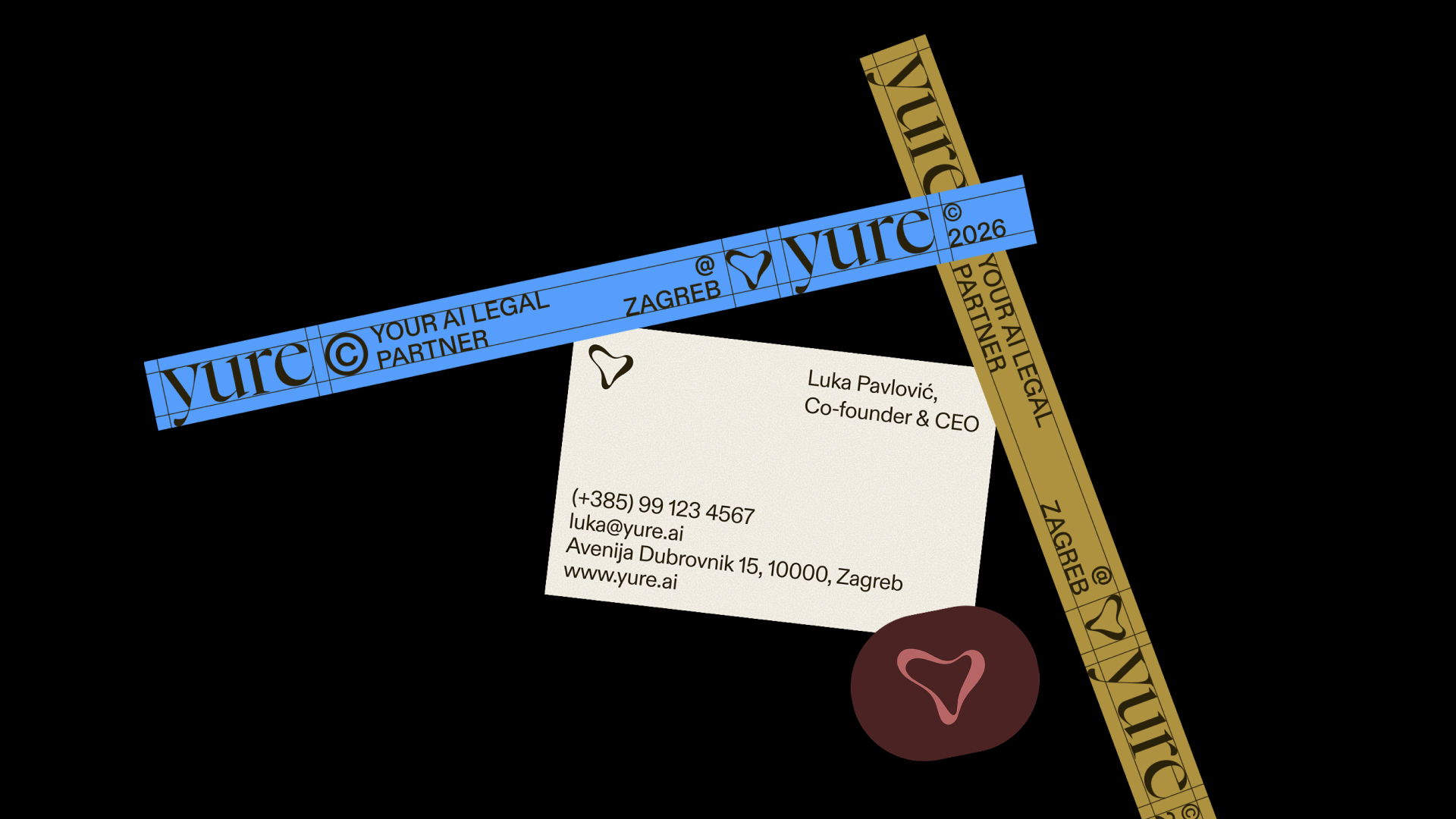
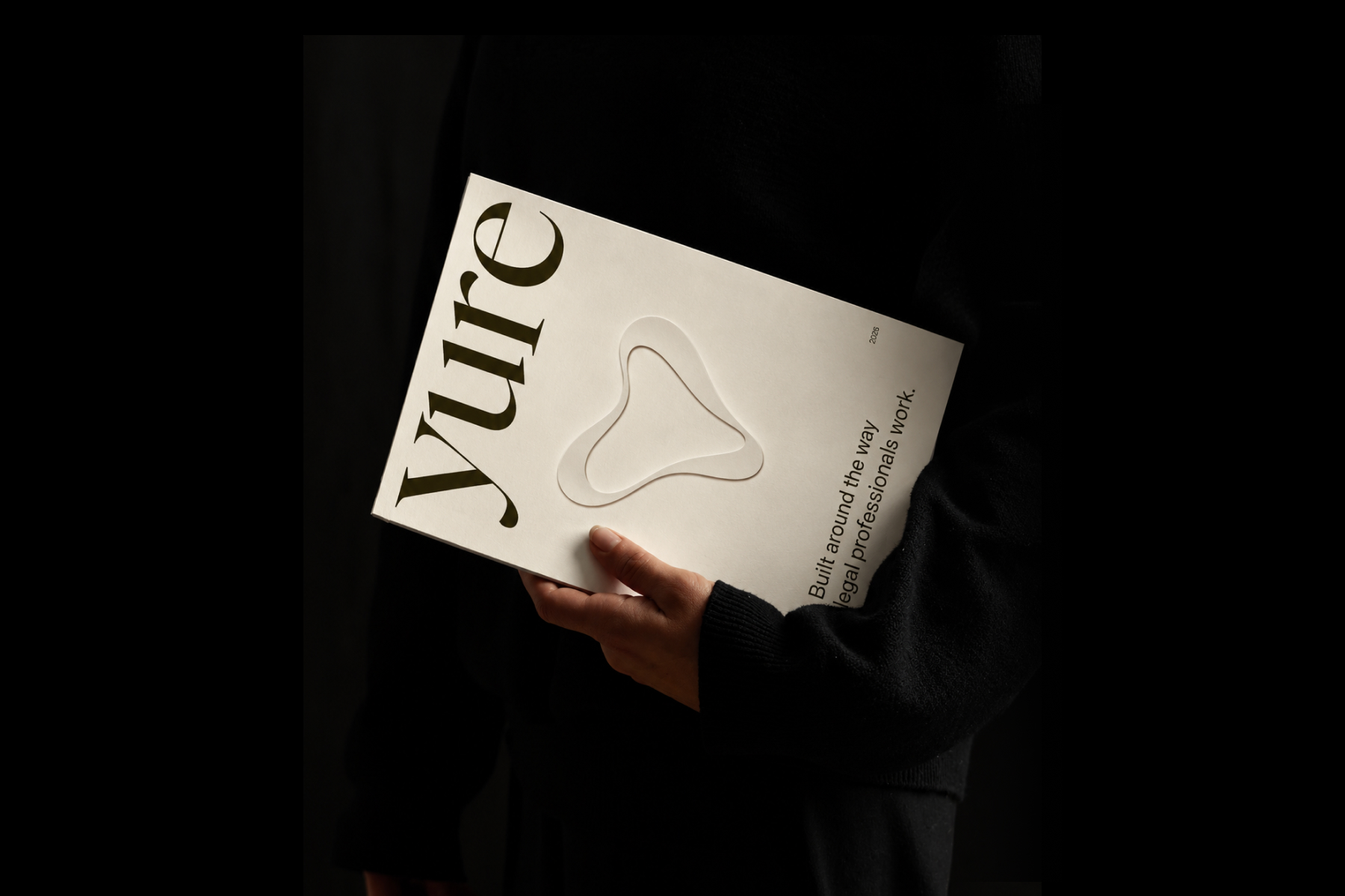
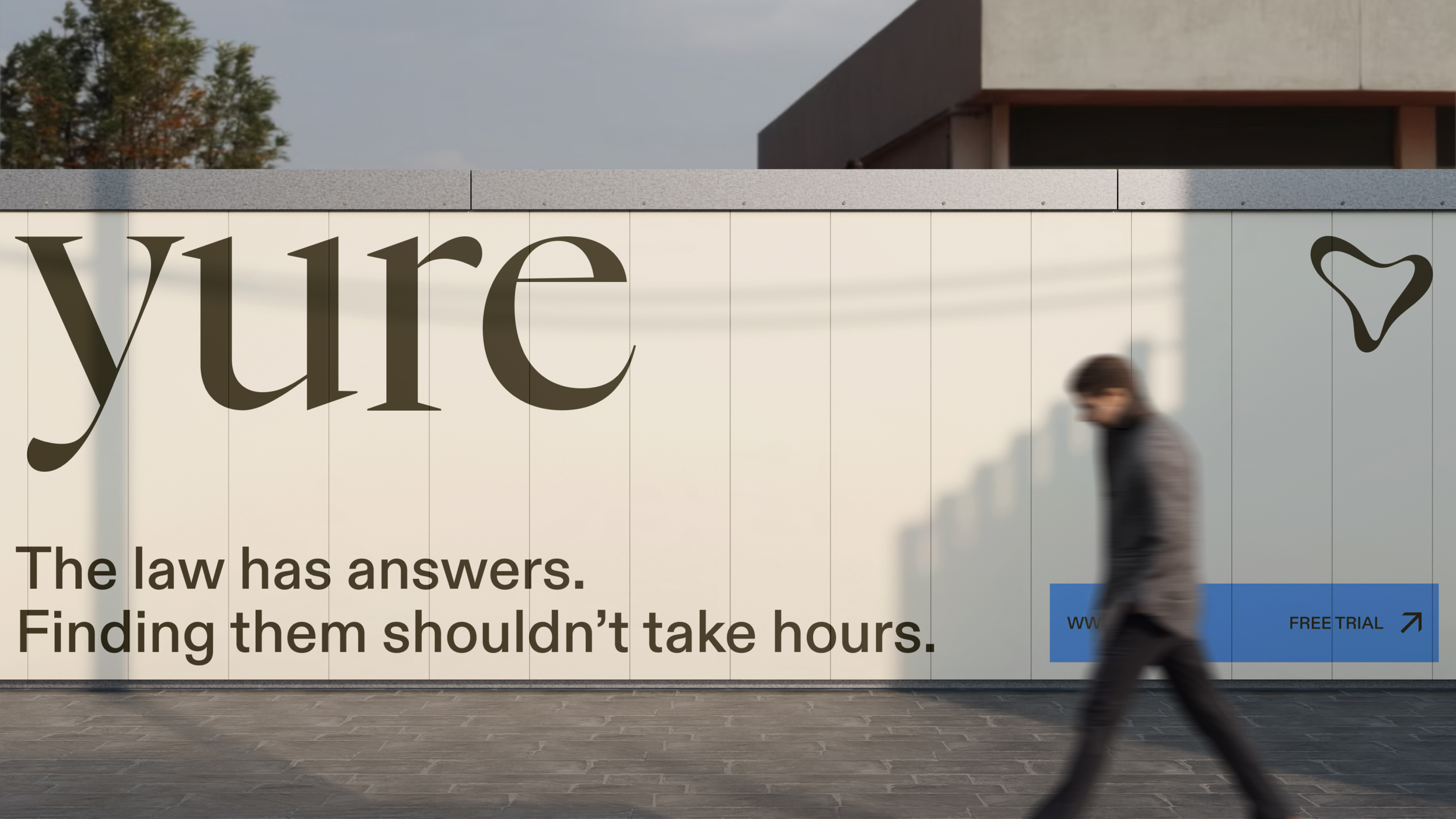
At the heart of the identity is a custom logomark conceived as an abstract portrait of Yure — an intelligence that is constantly thinking, processing and evolving. Through motion, the mark comes to life, translating the idea of “Yure is thinking” into a defining brand behaviour. Paired with a distinctive wordmark and considered typography, it creates a recognisable identity that bridges legal precision with the fluidity of AI.
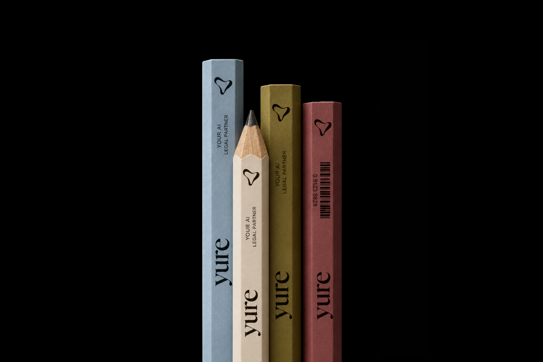
The palette combines warm off-white, earthy brown and deep burgundy with a vivid blue accent, balancing Mediterranean warmth with technological precision. The name Yure carries a familiar, distinctly Croatian sound while remaining contemporary and accessible internationally. Together, the name and colours give the brand a sense of origin without limiting its global ambitions.
We redesigned Yure’s app from the ground up, rethinking both UI and UX to create a contemporary, intuitive environment for complex legal workflows. Typography, colour, graphic elements and motion carry the new identity into the interface, making the product feel like a natural extension of the brand. The result is a unified digital experience built to support Yure’s evolution and international growth.