Greencajt has grown into one of the region’s leading festivals focused on sustainability, innovation, and the future of business. Over the years, however, the festival experimented with different visual directions in search of an identity that could truly reflect its ambitions. While each edition introduced something new, the brand lacked a cohesive system that could unify the festival’s communication and support its long-term growth.
For the new edition, the goal was clear: create a structured and recognizable visual identity aligned with the festival’s evolving message – “Good for People, Good for Planet, Good for Business.” Our challenge was to move beyond the typical visual language of sustainability and design a system that reflects Greencajt not only as a platform for environmental dialogue, but also as a space where innovation, culture, and responsible business intersect.
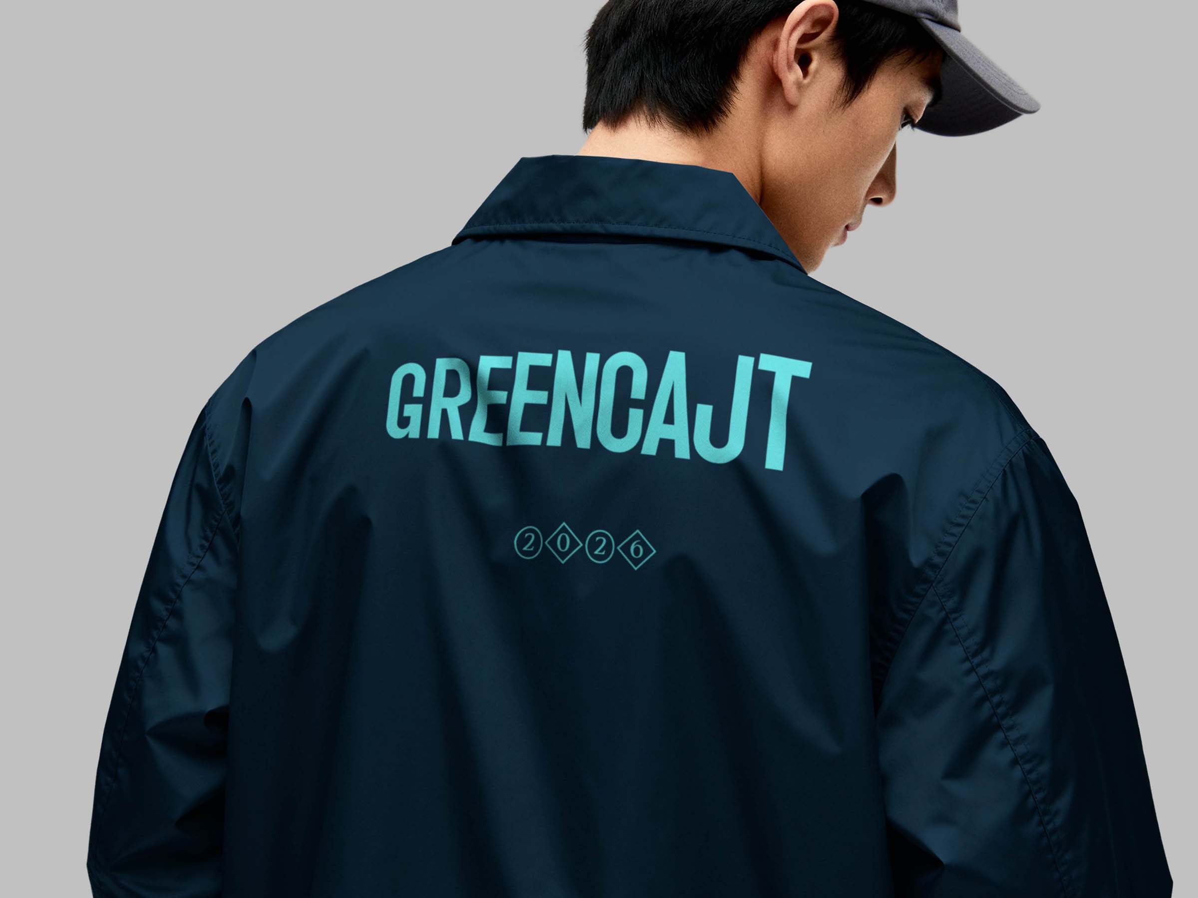
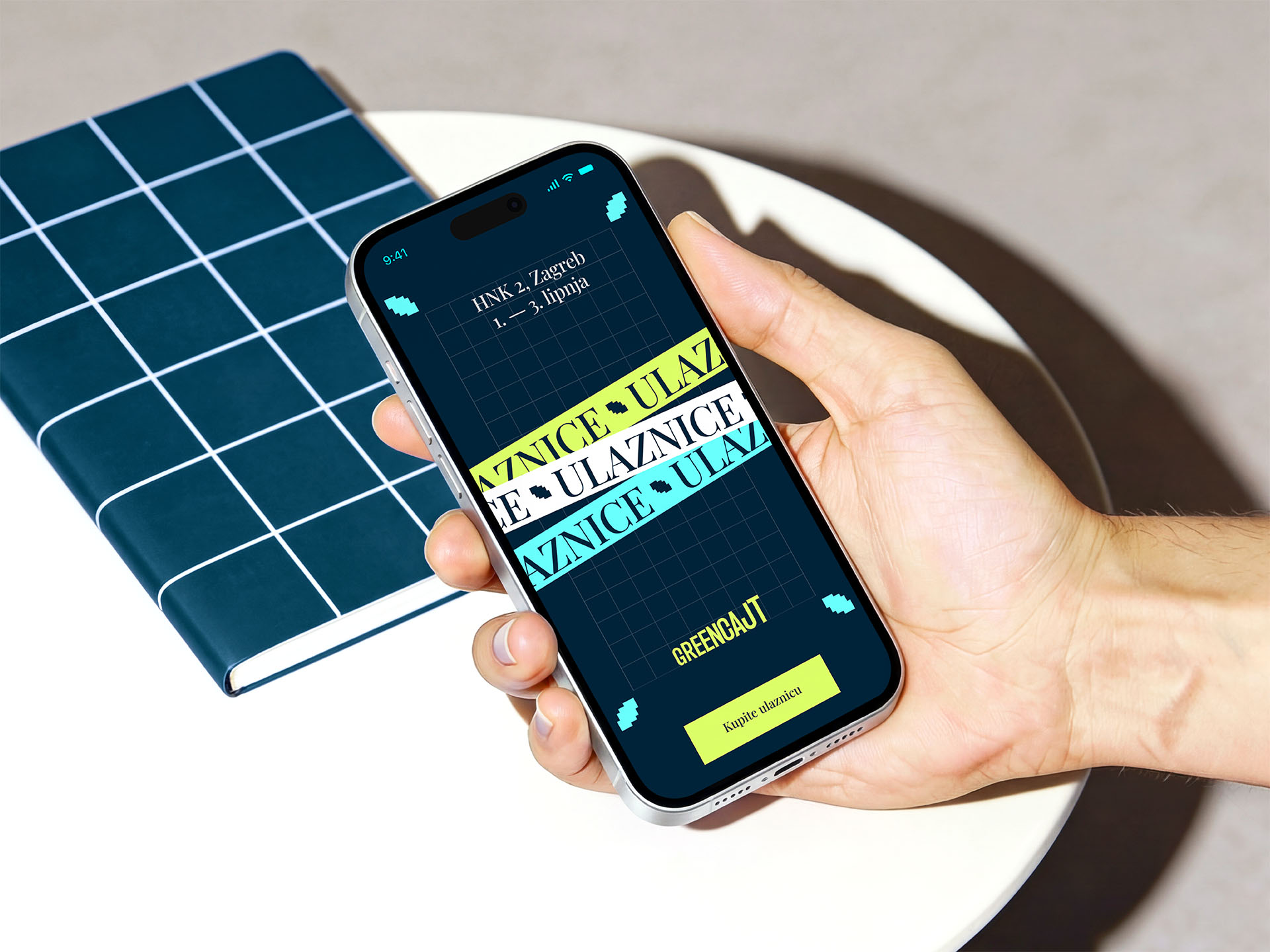
The identity is built around two dynamic accent colors — Aqua and Lime — symbolizing water and earth, the essential elements of the planet. Instead of relying on typical sustainability visuals, the palette introduces a more vibrant, digital character. This is paired with a dynamic typographic logo designed to adapt across different formats and materials. A pixelized leaf element completes the system, forming the corner framework of all visuals within a precise grid.
The result is a clear and scalable visual system that gives Greencajt a confident and recognizable presence. Balancing environmental symbolism with a contemporary digital aesthetic, the new identity positions the festival as a forward-looking platform where sustainability, people, and business meet.